Connecting Through Poster Sessions
Imagine you’re at a poster session. As you walk by the posters, you instantly understand the key points and ‘get’ the research. You find yourself stopping, reading, engaging with the presenter, and you’re inspired to think more broadly about your own work. Posters designed with the audience experience in mind create engaging sessions leading to new connections and collaborations.

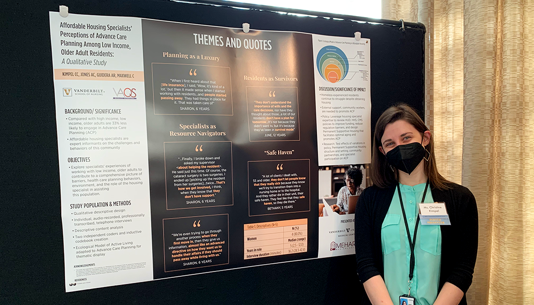
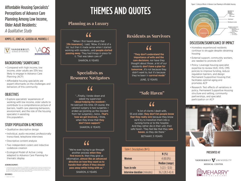
Christine Kimpel’s better poster design (image by Helen Bird)
That poster I noticed? The judges noticed it too and it won third place at Vanderbilt Translational Research Forum and a travel grant to Translational Science 2022.
I reached out to Christine Kimpel BSN, RN, MA, PhD(c), whose poster inspired me, and Caroline Taylor, Sr. Graphic Design/Multimedia Specialist for Vanderbilt University School of Nursing, who collaborated on the design of Christine’s poster, to share their insights with Edge for Scholars.
.
11 Quick Design Tips to Instantly Improve Your Poster
- Write clearly and concisely.
- Use bullet points and numbered lists to break up full sentences and paragraphs.
- Make each section shorter than a paragraph.
- Avoid big words in your title.
- Choose a sans serif font.
- Use the same font for the titles and body text. Make title font bigger and bolder.
- Format titles the same. Format body text the same.
- Left align text.
- Use 3 colors or less. Choose one of these colors to be the main color.
- Add images to break up a text heavy poster.
- Ask a colleague in a different field to give feedback.
.
Better Poster Design
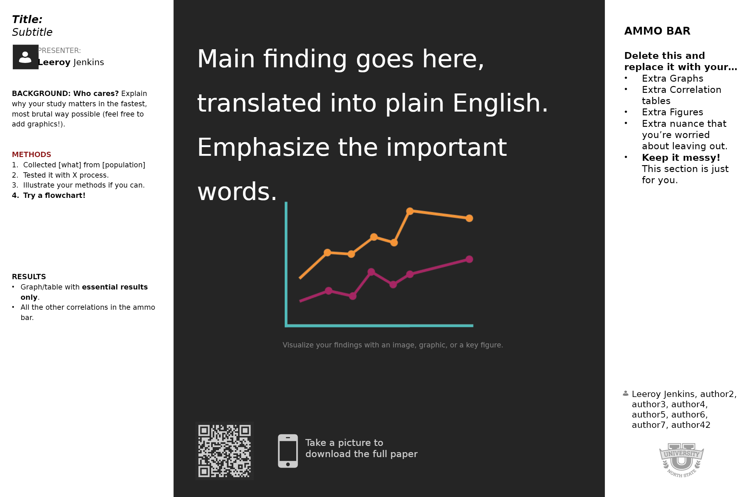
The Better Poster is designed to maximize insight, encourage conversation, and make it easy to quickly understand the research.

Better Poster Template (image by Mike Morrison)
The main finding, or key takeaway, is written in plain language and placed front and center. It is 12-15 words and easily read from 10 feet away. On the left is an overview of the study and to the right are the findings. A QR code links to more information.
Mike Morrison designed the new poster format and encourages presenters to adapt the template for their own needs, while keeping the poster clean, concise, and easy to read.
.
Newbie Strategies for Starting a Poster
- Start 3-4 months before you need to print the poster.
- Check the conference guidelines for required poster sections and size.
- Know the resources at your institution (graphic design, poster printing, etc.) and contact early.
- Work on the text a little bit and then leave it for a few days to get perspective.
- The results and discussion sections take the most time and thought.
- Posters are not read from start to finish. Each element should be understandable in any order.
- Discuss the best way to show results with your research team.
- Give your research team 2 weeks to review the poster. A call is helpful to hammer out the details.
- Be mindful of time and how long it takes to print the poster.
.
Steps for Creating a Poster in PowerPoint

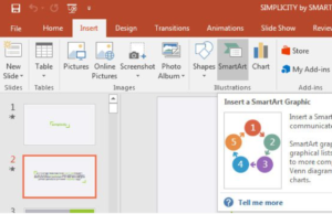
Use PowerPoint Designer and SmartArt to convert text to graphics, icons, and charts. (image)
- Write the text first.
- Change the PowerPoint slide to the actual size of the poster.
- Use separate text boxes for each section. Left align text.
- Copy the text info into the poster. Does it look chaotic?
- Eliminate unnecessary words and cut the text down until it will easily fit on the slide.
- Use bullet points to break up paragraphs and create space.
- Zoom to 100% in PowerPoint. If you can’t read the text, your audience won’t be able to either.
- Use PowerPoint Designer and SmartArt to convert text to graphics, icons, and charts.
- Design your poster on a main slide, but have other slides open to work on different elements.
- Put image credit directly under image, even if you use a free site.
.
Resources
Research Poster Best Practices
Create a Better Research Poster
Copyright Free Images (Unsplash is an Edge for Scholars favorite)
Poster Accessibility for People with Disabilities
.
Books
Better Posters: Plan, Design and Present an Academic Poster by Zen Faulkes
Effective Data Visualization: The Right Chart for the Right Data by Stephanie Evergreen
The Wall Street Journal Guide to Information Graphics: The Dos and Don’ts of Presenting Data, Facts, and Figures by Dona Wong
.
Thank you to Christine Kimpel and Caroline Taylor for sharing their expert knowledge with Edge for Scholars.
Christine Kimpel is a Registered Nurse, a PhD Candidate at the Vanderbilt University School of Nursing, and a first year Fellow in the VA Quality Scholars Program. Her clinical experiences with Palliative Care spurred her interest to explore determinants of Advance Care Planning. She earned her BSN (cum laude) and MA degrees from Kent State University. Her dissertation research focuses on identifying Age-Friendly Environment factors of Advance Care Planning among low-income, older adults. She plans to develop this program of research around the use of community-based participatory research approaches to reduce Advance Care Planning and Palliative Care inequities. Christine serves on the board of the Middle Tennessee Chapter of the Hospice and Palliative Nurses Association. Additionally, she is a member of the Iota at-Large chapter of Sigma Theta Tau and the Tennessee Nurses Association. At the VA, she is collaborating on the deployment of a quality metrics dashboard.
Caroline Taylor is a Sr. Graphic Designer / Multimedia Specialist for Vanderbilt University School of Nursing. There, she specializes in creating visual marketing objectives that best benefit the school, as well as faculty and staff. Her research poster designs have been featured by VUSN’s faculty, winning nationally ranked awards.

Christine Kimpel BSN, RN, MA, PhD(c) won third place at Vanderbilt Translational Research Forum.
Further Reading from Edge for Scholars
Best Poster Resources for Trainees
The Newbie’s Excellent Infographic Adventure
PowerPoint Hacks for Scientific Poster Design
Making a Better Research Poster
Home Page ImageCreator: Helen Bird


1 Comment