
The Newbie’s Excellent Infographic Adventure
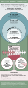
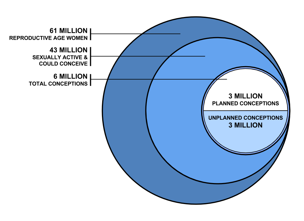
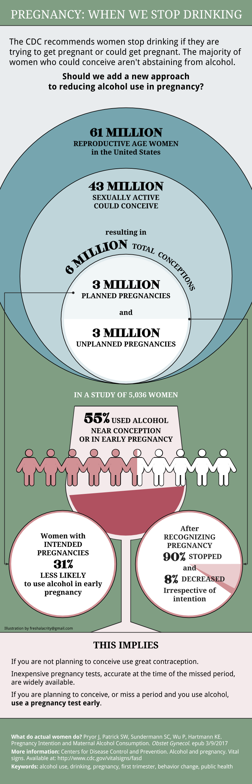
Our research team was preparing for the release of a paper describing alcohol use around the time of conception and in early pregnancy. We were heartened to find that while 55% of women used alcohol in that timeframe, 90% of them quit drinking and 8% reduced use promptly at the time of a positive pregnancy test. They did this early around the time of a missed period (29 days on average) regardless of whether the pregnancy was planned or not.
From there the infographic adventure was a downhill slalom at breakneck speed and the starting gun was a Twitter post:
- March 2, 2017 @edgeforscholars tweeted a link to a blog about how to create an infographic from your paper.http://www.jmmnews.com/how-to-turn-journal-article-into-infographic/
- Looking at the draft media release in the team meeting on March 7, someone mentioned the tweet (ok – it was me) and we agreed it would help to have a visual to make the implications more clear.
- We worried that the most recent CDC guidance was aimed at an unusually large and challenging target–namely, advising 43 million women who could become pregnant not to consume alcohol.

- Then we worried how the media might use the unadorned figure. We didn’t want to claim we had evidence to change the CDC guidance but did want to raise the question of an additional approach.
- Two days from the March 9 release we contacted a freelance artist. (We didn’t want the university medical illustration group to laugh us out of the office.)
- Overnight we got back a draft and realized we didn’t get close enough to plain language. And our graphic was too cheerfully vivid for the topic and it included an image of a martini glass. (This made the literalists crazy since the most common alcoholic beverage among cohort members was wine.)
- One day out we were requesting the changes above plus a revision so that a relative risk of “30% less likely” doesn’t look like a pie chart.
- Then we added references, because we are scientists.
- Then we reworded the parting text to align with the wording of a video produced to share with media (this was a normal part of the package).
- Then we changed the font, fixed a word or six or seven, and were glad the designer was in Portland so she couldn’t come across the country strangle us.
- The night before the release, after about 6 hours of total design time for art and over-communication and our re-dos, we have a product.
The embargo lifted, the media materials rolled out, and a total of 46 media outlets with over 55 million audience members mentioned the study or covered it outright. This DOES NOT happen for reproductive epidemiologists. The most consistently used pieces of the press packet? Quotes from the text version of the release and the infographic.
The infographic is not perfect. We would have continued edits by changing to a sans serif font, using more transparent colors, continuing to simplify the language, and on, and on…
But it did the job. Real people thought about a topic, understood it better, asked questions, commented and considered if we had a useful idea born out of observational research. (Can see it used in an article here.) And we became converts.
Upshot: we will definitely do it again. Next time we swear we will start when the paper is accepted in order to hang onto our designer who brought this whole thing home for under $200 with lots of rapid cycle learning. Given better planning on our part we suspect this can be a 2 to 3 hour job. Completely worth the effort to help assure a clear message.
More later on do-it-yourself tools for infographics. Stay tuned.
Want to live on the Edge?
RegisterAbout the Author

Screen Name
About Me
No nonsense purveyor of evidence-based mentoring and dedicated disruptor of dogma. Think big, plan well, and live creatively.


0 Comments