
PowerPoint Hacks for Scientific Poster Design
Scientific poster creator Nicole Zaleski shares her design hacks for using Power Point to design posters like this Drug Repurposing poster titled Accelerating Precision Drug Development and Drug Repurposing by Leveraging Human Genetics for 2016 Personalized Medicine Day.

Accelerating Precision Drug Development and Drug Repurposing by Leveraging Human Genetics.
Starting Out
Start by exploring and making a few practice designs. A familiar set of tools with flexible functionality is essential to professional quality design. Basic Power Point skills and design sense are all that’s needed to use the built-in template and tools to create the various components of a visually exciting poster.
Look at the data and consider the best visual representation of the information by seeking inspiration from other posters which have been done well. For ideas about how to display data, check out Zaleski’s favorite book, Effective Data Visualization, written by sought-after speaker, designer, and researcher Stephanie D. H. Evergreen. Create Excel charts and graphs that best communicate data findings in this comprehensive how-to guide for conveying data for maximum impact, written in a humorous and approachable style.
DESIGN TIP: Find a model you like and use that as a guide for your work. Look at the colors or layout used, and then make it your own. Even with all these digital tools, often an idea for an image or graph comes first in the form of a sketch (which is then created digitally).
But where does that first idea come from? Zaleski revealed an example of an actual prompt she received from a project lead for one particular assignment (hooray for email archives), seen in Figure A:
“Idea for a graphic: study flow diagram where participants join study, contribute data, share preferences for what kind of data they would find valuable to receive back, researchers analyze data and convert/transform it then return that value back to participants, who then experience benefit (increased learning, increased sense of engagement, better understanding of how their data fits in the big picture, etc.) Participant has a lightbulb and smile?”
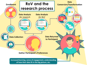
Figure A. This slide was created for a Trial Innovation Network webinar presented by Dr. Consuelo Wilkins.
The Design Process
With a prompt and a sketchpad, the first draft of the design concept is created. Using Power Point tools, the graphic can be brought to life digitally with simple text boxes and shapes. Look like a pro by using design techniques like layering, transparency, gradients, high quality stock photos and icons. Just be cautious not to overdo it, a clean and clear design is always a classic.
- Search for free Photos on Hubspot’s 20 of the Best Free Stock Photo Sites To Use In 2017.
- Find icons at Flat Icon,the largest database of free icons available in PNG, SVG, EPS, PSD and BASE 64 formats (free images but must credit image source).
Once the overall layout is achieved and the right data is displayed in a way that makes sense and is visually interesting, complement the design with custom colors.
To discover a coordinating color palette look at the project’s logo, get inspiration from the world around the work being done, or check out the built-in color families within Power Point.
- Find complementary color palettes with Adobe Kuler while wasting time, I mean, taking a break from working on the poster design.
Zaleski, the Power Point ninja that she is, found a sweet color in one of the icons she downloaded and wanted to use that as the foundation for her color family. Using a tricky technique, she pulled the colors from the icon and used it to coordinate the other images and text boxes to match.
- RGB Hex converter takes input in the form of values for Red, Green and Blue ranging from 0 to 255 and then converts those values to a hexadecimal string that can be used to specify color in html/css code.
Using the dropper tool it’s possible to copy and view a color from one image, which appears as RGB. Using this site allows you to convert that RGB code to Hex, which may be useful for custom colors in other icons or programs.
Final Considerations
Before calling the poster “final”, a few informal hallway focus groups with individuals unrelated to the project can help identify potential issues with the data visualizations and layout. Always print a proof (as many times as it takes) and review it (and have another trusted person review carefully) before sending the final version to print.
To be sure the printed quality matches what’s on the screen, increase the DPI on PowerPoint before exporting to print. Double-check settings especially for grant figures which may require 300 DPI settings.
Adjust the brightness of images with Power Point.
Warning: Designing a super-sleek and professional scientific poster may cause others to seek out your skills for their next poster (or blog post).
About Nicole Zaleski
Nicole is a Project Coordinator and Research Analyst within the Vanderbilt Institute for Clinical and Translational Research (VICTR) where she works with large, interdisciplinary teams that focus on utilizing human genetic data to drive drug discovery, translational research and clinical research projects in a broad range of therapeutic areas. Within the Drug Repurposing Program, she uses design skills to translate complex ideas into attractive visuals for grant proposals, peer-reviewed manuscripts, printed materials, and Power Point presentations for diverse audiences.

Want to live on the Edge?
RegisterAbout the Author

Screen Name
About Me
Social media powerhouse focusing efforts on community building, health communications, and education/career development.


0 Comments