
Storytelling with Data: A Data Visualization Guide
“My goal is to help rid the world of ineffective graphs, one exploding, 3D pie chart at a time.”
Drawing from the fields of graphic illustration, functional art, behavioral science and storytelling, Storytelling with Data by Cole Nussbaumer Knaflic is a must for academics who present data for others to understand.
The first seven chapters focus on specific topics such as context, clutter, color and design. Included is a chapter on story construction and verbal language, which helps for quickly assessing the inference from the data sets. No matter how effective your graphics are, some people will remember the ‘story’ you tell more easily than the graphics you show.

Putting it all together (chapter eight) applies the lessons to a particular situation. Each step takes the pretty, colorful, but complicated chart to a clear line graph that speaks for itself. Add the verbal story to the new graphic and no one will be in doubt about the conveyed message.
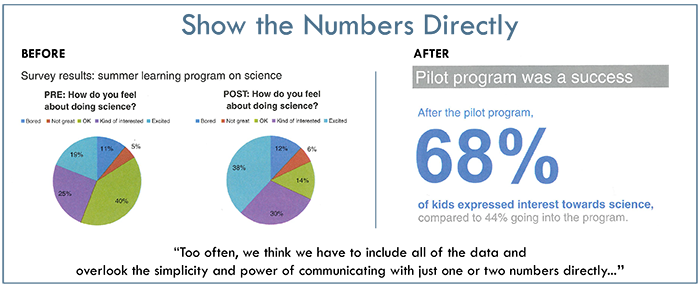
Five case studies are compiled into chapter nine making them easy to find. The chapter includes specific examples of how clear, simple graphics can paint your picture. With data sets, graphs and charts, we forget that others can’t always see what is obvious to us. Knaflic creates clear and simple graphics that tell the desired story.
 Take note of her advice to improve your posters, proposals, and papers.
Storytelling with Data by Cole Nussnaumer Knaflic
Storytelling with Data PODCAST
Home Page ImageCreator: Helen Bird
Want to live on the Edge?
RegisterAbout the Author

Screen Name
Pat Bird, MHSA, MA (Conflict Transformation)
About Me
After a life time of teaching, administering, managing and supervising in public, private, for-profit and non-profit organizations, I have retired! My interest in what makes people tick and what makes some more successful than others remains. Reviewing such books is a pleasure that feeds my brain and soul. Watch out - the next review might be about the book for you!!


0 Comments