
DIY Infographics: 3 Tips and 3 FREE Resources
1 – Limit bright colors

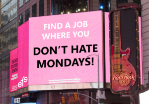
Designed on Canva.
Eye-catching orange is good…in moderation. Think of using bright colors in graphic design like buying vowels on The Wheel of Fortune– use sparingly because they will cost you.
2 – The rule of thirds
Look at your infographic in sections and be sure it is balanced. Divide it in thirds like a tic-tac-toe grid – seeing it this way helps guide your eye naturally to the important images.
Three is a special design number. You can apply the rule of three to your content as well. Try not to use sets of more than 3 facts/shapes/colors on a chart. Keep with a simple color theme and highlight key data.
3 – Make text pop
All zoomed in on your full screen desktop computer the design may look fantastic, but be sure to view it on your smart device (aka teeny, tiny phone screen) to ensure that everyone else will be able to read the details and understand the message.
Text takeaways? Concise copy. Clean font (preferably sans-serif). Say more with less for optimal visual impact.
Bonus – Designer Pro Tips
- Don’t use too much light text on dark background or it strains the eyes.
- Maintain sufficient white space to make messages easy to read.
- K-I-S-S: Keep It Simple Smarty. Don’t “dumb it down”, but be direct and let the data be clear enough to avoid lengthy explanations or captions.
FREE Infographic Design Tools
1- Venngage

Designed on Venngage.
- Yays – Great basic text options, quick output.
- Nays – Backgrounds limited. Only posts to social media with free account, can’t save and download image.
- Helpful resources
2- Canva

Designed on Canva.
- Yays – Paste data from spreadsheet to populate charts and diagrams.
- Nays – $1 add-ons for designs. Limited photo stock.
- Helpful guides
3- PiktoChart

Designed with Piktochart.
- Yays – Easy plug and play templates, easy data display preview options and data file import.
- Nays – Upgrade for Piktochart watermark removal, high resolution image download, pdf image download.
Have a creative infographic you’ve designed? Share your PRO TIP in the comments, or share the link to your infograph so we can scrutinize, I mean SEE your example!
Looking for more infographic support? Check out these additional articles:
19 Warning Signs Your Infographic Stinks
Even Infographics Have Size Standards
Want to live on the Edge?
RegisterAbout the Author

Screen Name
About Me
Social media powerhouse focusing efforts on community building, health communications, and education/career development.


1 Comment
This is very helpful – thank you! The KISS rule is so important, and I love the colors in your top graphic.