
Creating Effective Infographics: An Interview with a Pro
Evan Aleclare Hartmann helped us develop some infographics related to the importance of science funding. We asked Evan some questions about how to make an impactful infographic, even without the help of a graphic designer.
1. What have you found to be the easiest way to sort through or organize the data you use for infographics?
I look for information that can have a visual impact as well as forming part of some kind of narrative structure. I want the infographic to be noticeable, easy to read, and leave people with a sense that they’ve learned something. I generally go with simple statistics (since they can be clearly illustrated) that I don’t think are common knowledge and which, when chained together, lead people to a logical or intuitive conclusion. In short, pick simple but surprising bits of information and use them to tell a story.
2. Can you share a couple of your favorite infographics (yours or others’)?
Here’s an interactive, minimalist take on planetary scale
And a side-by-side comparison carbon emissions
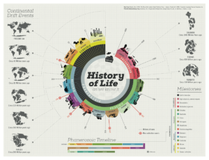
A poster that has a graphic overview of the history of life
A poster with language families and how they descended
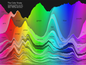
A visualization of color names following a survey by XKCD
And a helpful selection of visual representations to consider when making graphics
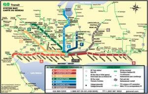
My favorites of all time, though, are the infographics we see all the time: transit maps. George Dow and Harry Beck were pioneers in the modern style of transit maps, and now what they started is ubiquitous, not to mention incredibly useful.
3. How long does it take to create an infographic? And what can someone expect to pay?
The time depends on who is making it and the content; sometimes it’s an expert in the field, an amateur with an interest in promoting the information, a specialist designer, a team of designers, a designer that specializes in something else, or some combination of those!
I usually expect to spend 3 to 8 hours on each infographic spread over several weeks or months, and since I charge $45 per hour that ends up being upwards of a hundred dollars but less than five hundred. Part of that is because I favor a more simple, clear-cut style with relatively condensed information; a more ambitious infographic with a huge amount of information or detailed lifelike illustrations – like the ones you see on Pinterest or printed on posters – may easily have taken upwards of twenty hours of work in research, design, and editing.
4. What skills and/or software are required to complete a good infographic (assuming someone who isn’t a graphic designer is making it)?
Online tools can be helpful for people who aren’t wanting to learn how to use more powerful software: I’ve known people to use canva.com and piktochart.com (vizualize.me also creates some beautiful infographic resumes) but I haven’t tried any of them personally since I like to start from scratch. For simple things, I use a basic vector editor or presentation type software (like PowerPoint or Google Slides) but most professionals use Adobe Illustrator. That being said, there’s no reason you can’t create an infographic offline (especially if you’re decent at geometry); just plan it out on graph paper and use a ruler, a protractor, and plastic drawing templates if you want crisp lines for things like pie charts, then scan it. Sometimes I’ll get that kind of thing from a design client, and take a scan or photo of their original sketch to digitize it with a minimum of changes; they usually turn out great!
I’d also recommend this article related to creating infographics.
5. Do you have some favorite online sources you use for inspiration?
No, not really. I take inspiration from a wide range of sources. Infographics and infographic design is something I’ve been interested in for a long time, so I feel like I see them everywhere – walking around, on random blogs, in Google image search results and all over Pinterest and other social media websites.
6. What features should an impactful infographic include?
Sources. For me personally, if sources aren’t included it isn’t an infographic; it’s simply an illustration – one that needs to be in context to be taken as a meaningful source of information. Of course, it also helps to have a title and so on, but sources are incredibly important. Including a link to where the information came from (or several links) is usually sufficient since most infographics don’t use any actual citation format.
7. What advice can you give someone who wants to create an infographic?
- Look at what’s out there and see what other people are doing.
- Leave plenty of space between and around things.
- Take out anything that’s not absolutely essential.
Evan is a freelance graphic designer with a passion for clean, lucid graphics. Their focus on scientific research and educational material is driven by the belief that information is powerful and the more accessible we can make the world’s scientific data to the public, the more the public can make the kind of informed choices that lead to a better world.
Evan can be contacted at freshalacrity@gmail.com.
Want to live on the Edge?
RegisterAbout the Author

Screen Name
About Me
Freelance writer for Edge for Scholars. Nashvillian via North Carolina with a background in marketing, blogging and editing, and an interest in the entrepreneurial aspect of academia. Lover of the outdoors and coffee. Mom to 5 four-legged kids.


3 Comments
Adobe Capture is a neat phone app which can do what you said, take a photo of a drawing or anything really and it will digitize it and send it to Adobe Illustrator to clean up. I also like Canva, but have been pleased with other free tools and find they are very user friendly these days. Nice article, good tips.
[…] Edge for Scholars: Creating Effective Infographics: An Interview with a Pro […]
[…] This blog post on Edge for Scholars also outlines a method for developing an infographic from your latest article. […]