A Quick Fix for Death by Powerpoint
Death by Powerpoint. We’ve all been there. Droning speakers with slides crammed full of information using eye-jarring colors that leave you ready to fake a seizure to get out of the next 50 minutes of your life.
The funny thing about this Death by Powerpoint condition is that while everyone has experienced this as an audience member, no one is guilty of giving a terrible presentation. Which makes for some interesting math. Who are these terrible presenters?

Let’s face it. You’re the problem. But what’s a scientist to do? You have technical information to convey and a message about why your project is compelling. Getting both done well is a very real world challenge and it’s rarely done right.
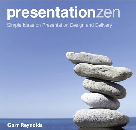
Enter Garr Reynolds, founder of presentationzen.com Reynolds has created a series of books, presentations and workbooks to allow you to hone your message down to its essential elements. A key component of Reynolds’ message is that you have to let go of all the work you’ve done. The blots, the RNAseq, the cloning….all of it. Your goal in adopting Presentation Zen is to stop using your data as a crutch. Assume people will believe you are a smart, honest and informed person and stop showing them Every. Single. Thing. You’ve done.

In his book Presentation Zen, Reynolds underscores the need to get away from painful details using examples from technological powerhouses Bill Gates and Steve Jobs. Gates crammed in information on technical aspects of his platforms, predictions for growth, careful surveys of risks and benefits. He also is approximately as charismatic as melba toast. Jobs was a polar opposite. His presentations were about challenges and opportunities. He told stories in which you personally could be the hero if you just had his product. Reynolds argues that your audience, even if they are technical experts, is better served by having a compelling pitch and thorough understanding of the details that you can address in follow up questions.
Presentation Zen is very much like Reynolds’ Powerpoints. Graphic heavy. On point and designed to spark conversation. You can easily read it in an hour and then leave it on your desk to reference for a year as you use it to end your contribution to Death by Powerpoint.
___________________________________________________________________
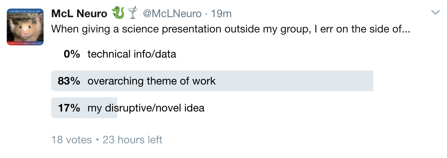
Your comments are welcome and there’s also 24h to jump online and participate in our poll on how you try to balance your presentations.


0 Comments