Optimizing Colors for Projected Presentations
You worked for hours on your presentation for your society’s annual conference. On the day of your big presentation, while going through the slides on the projection screen, you notice your slides are looking “off.” Something is not right. What could it be?
Your nice pale greens have turned into blinding fluorescent chartreuse, and your yellows have become a muddled brown. The beautiful shades of blue you used to create a complicated bar graph all look like the exact same color. Your thoughtfully crafted slides have become eyesores to look at.
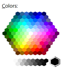
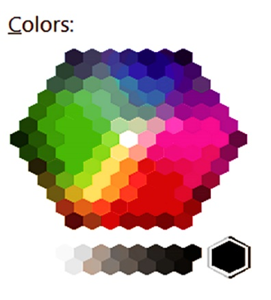
Projectors tend to not display the colors exactly as they appear on your computer screen. This can lead to colors and images that look great on your monitor not looking very good when they’re projected onto a screen.

Monitor Colors

Projector Screen Colors
Solution:
Test, test, test! If possible, test on the screen you will be presenting on. If that is not possible, opt for a color scheme of contrasting colors that are more saturated—the more muted the colors on your monitor, the more likely they will blend together on the projection.
Your institution or department’s standard template may work well for printed material but not translate well to a projector. The colors in your presentation may need to be adjusted to a different shade in order to present better and retain an institutional connection.
Rules to remember:
- Test colors on the presentation projector or monitor whenever possible
- Avoid subtle color combinations as they do not show well on a projector
- Avoid vibrating color combinations, like red and green, as those colors which appear to “vibrate” when viewed on a screen as some in your audience may have red-green color blindness or it can give some people a headache
- Use high contrast color combinations, which are a safer bet for presentations. Background and text need to have enough contrast for readability

Monitor View

Projection View
Creator: Sephirus Communications


0 Comments