Even More Cranky
 Since the holy trinity important things have come in threes—listen up. Not all beautiful things are functional or practical. Think white upholstery, stiletto heels in the lab, bilateral justification of your grants. Bilateral justification is from the devil. It’s a cognitive drain and subtle form of punishment for your reader.
Bilateral justification (both left and right margins are flush, meaning straight):
The eye uses the ragged right edge to scan written materials efficiently. If my subconscious is telling me I am reading slowly, it also tells me your text must be dense or dull.
You need your reviewers to have optimal comprehension. I will appreciate significance and innovation better, and think about your approach more lucidly, if I remember your prior material.
- Causes stilted writing.
You know you do it. You see a line or paragraph with unappealing spacing and change or add some words like changing “use” to “utilize”, or adding unnecessary connectors such as “therefore” to adjust the spacing. Switch to left justification and edit like a fiend. Your text will get leaner and more concise. I will be happier.
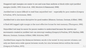
Quit ignoring the evidence about best practices for formatting (Table 3, below).

Don’t make my brain tell me I am slogging through your content. It makes me cranky.
Other resources:
Designing Instruction and Informational Text
How Document Readability and Legibility Are Affected by Text Justification
More crankiness:
Three (Grant) Peeves in a Pod: Formatting
Three (Grant) Peeves in a Pod: Appearance Matters
Three (Grant) Peeves in a Pod: Write Better


1 Comment
Thank you for saying out loud what I’ve mumbled to myself a hundred times.